Branding, Design, Layout, Photography, Art Direction
MomTog Magazine is a publication offering style guides and photography tips and tricks to mothers who are hobbyist photographers wishing to improve their photographs with no intention of becoming a professional or purchasing expensive gear.
My goals for this project were to create a publication that would fill a void in the current photography magazine offerings, designed for mothers who are hobbyist photographers and not professionals. The publication features typography, color choices, subject matter, and imagery that appeal to the senses of all mothers.
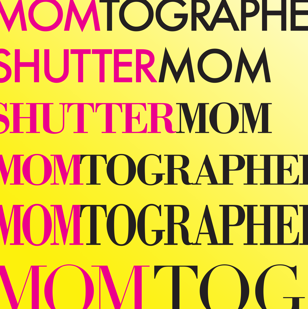
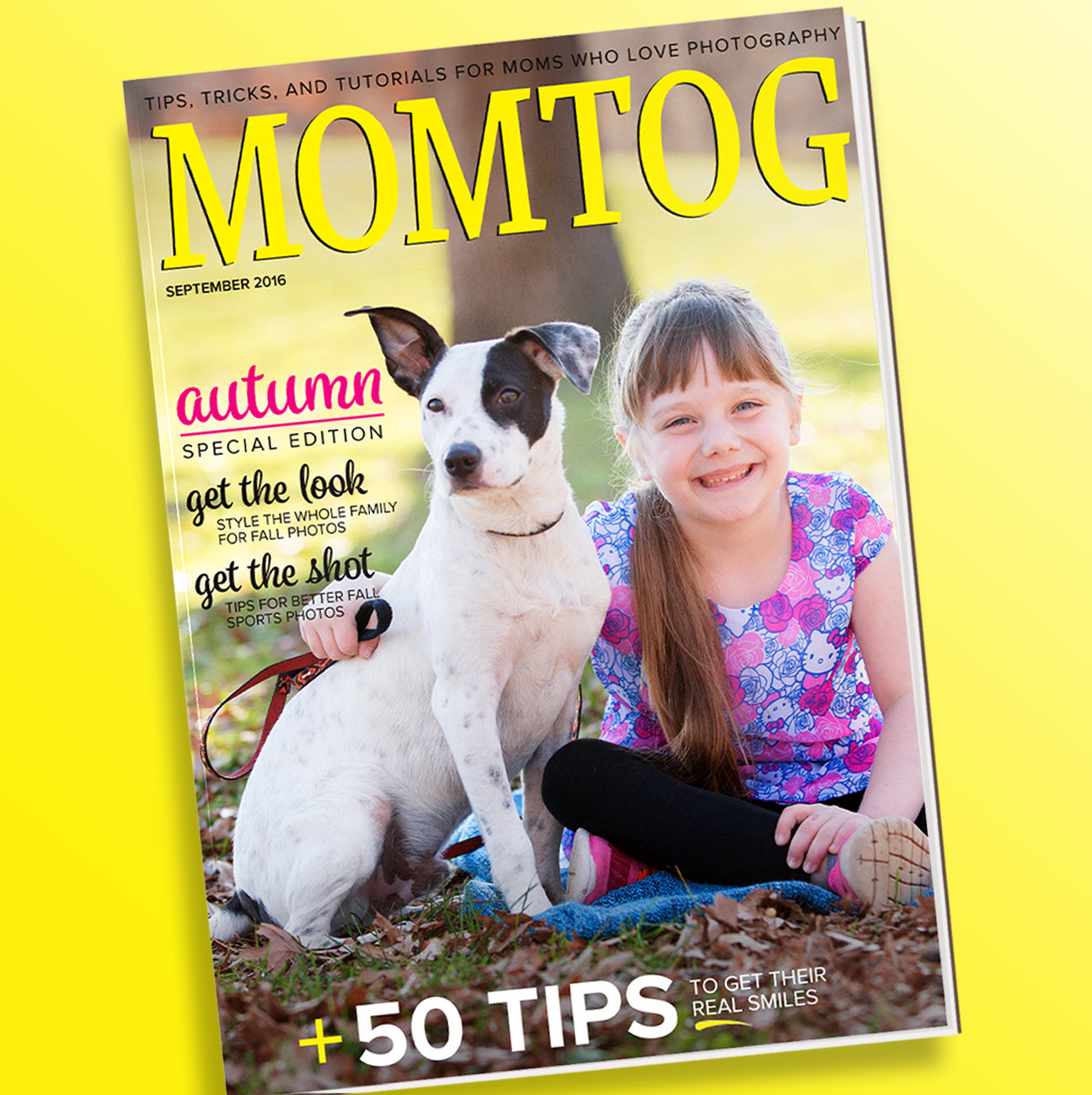
I experimented with titles as well as fonts that embodied the emotions I needed the title and cover to convey: elegance and allure with a trendy undertone. I preferred the look of a modern font, but the detailed imagery of the covers would require the use of a font with thicker serifs, so I found a font that echoed many of the characteristics of a modern font: long, graceful serifs, without as much contrast in the thick and thin strokes, to maintain readability from long distances and over detailed photos.
I used a single color for the title so it could easily vary to compliment the background imagery and subject matter of each issue. Cover imagery will feature bright colors and beautiful photographs of children that appear candid, using natural lighting situations that could be achieved using the tips and tricks found inside the publication. Both the title and the imagery are meant to be spotted from a distance, grabbing the viewers attention and enticing them to come closer and read the issue features.
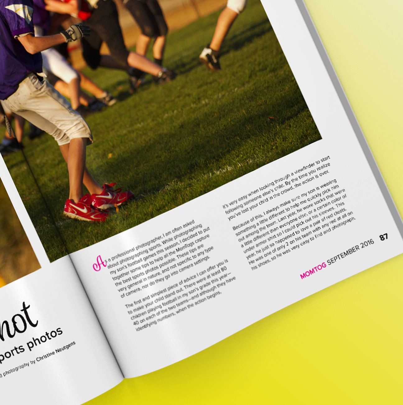
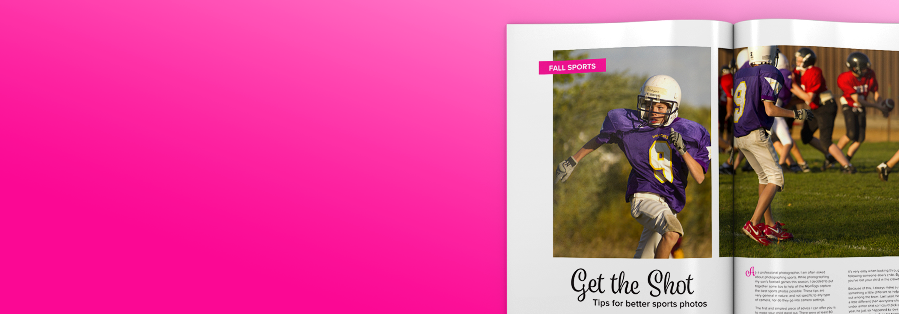
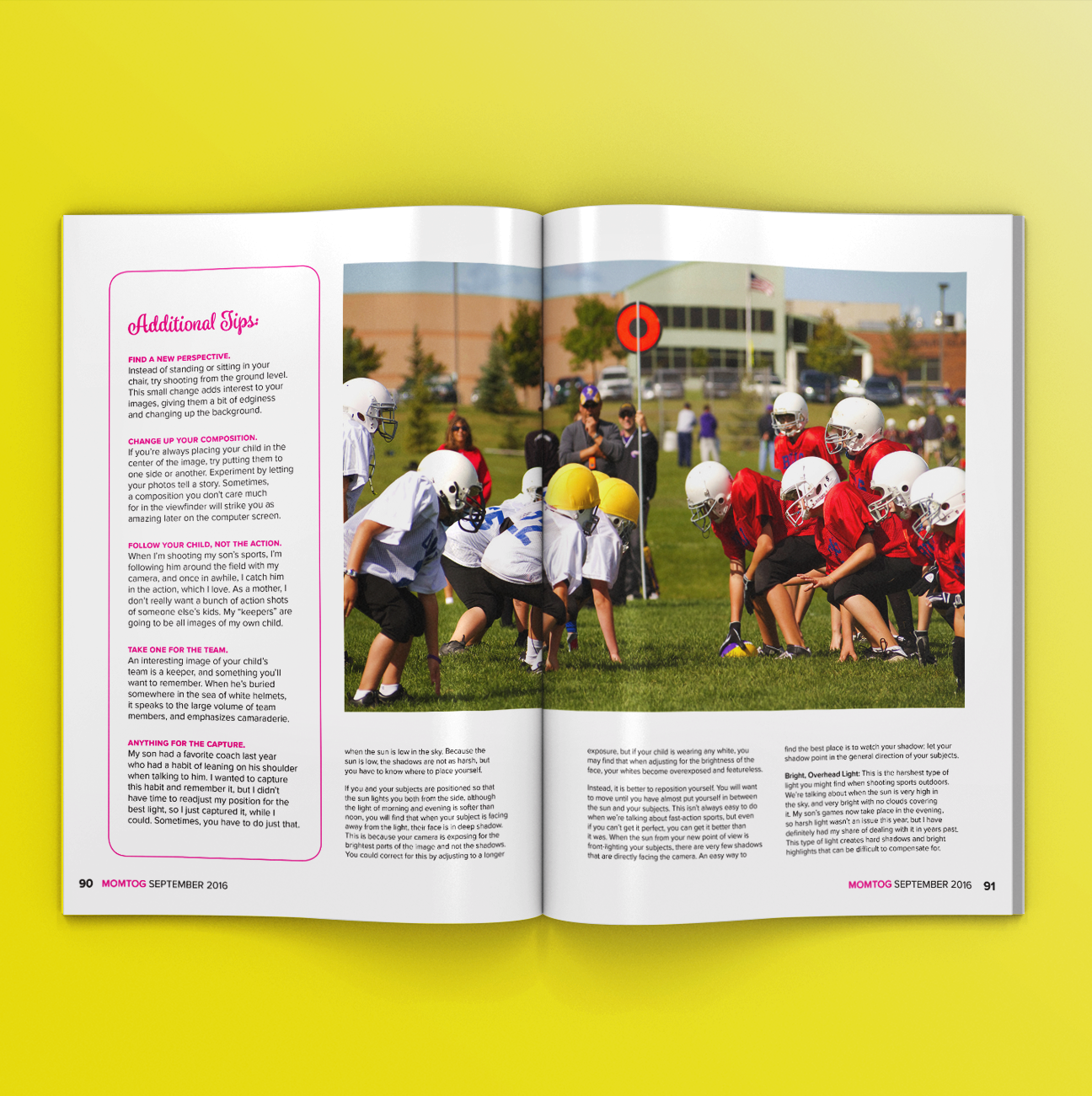
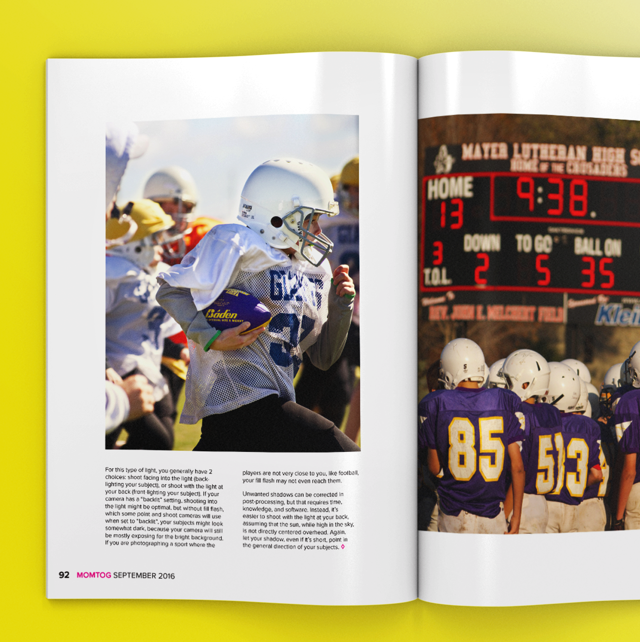
I created a layout for a typical MomTog article, featuring spacious margins and a clean hierarchy with pops of pink and an elegant but highly readable script paired with an open, geometric sans-serif. I used vast white spaces to balance the large, colorful imagery that alternates between the containment of wide margins, and bleeding fully across the gutter or off the page, attracting the viewer to both the desireable photographs and the tips to obtain them.
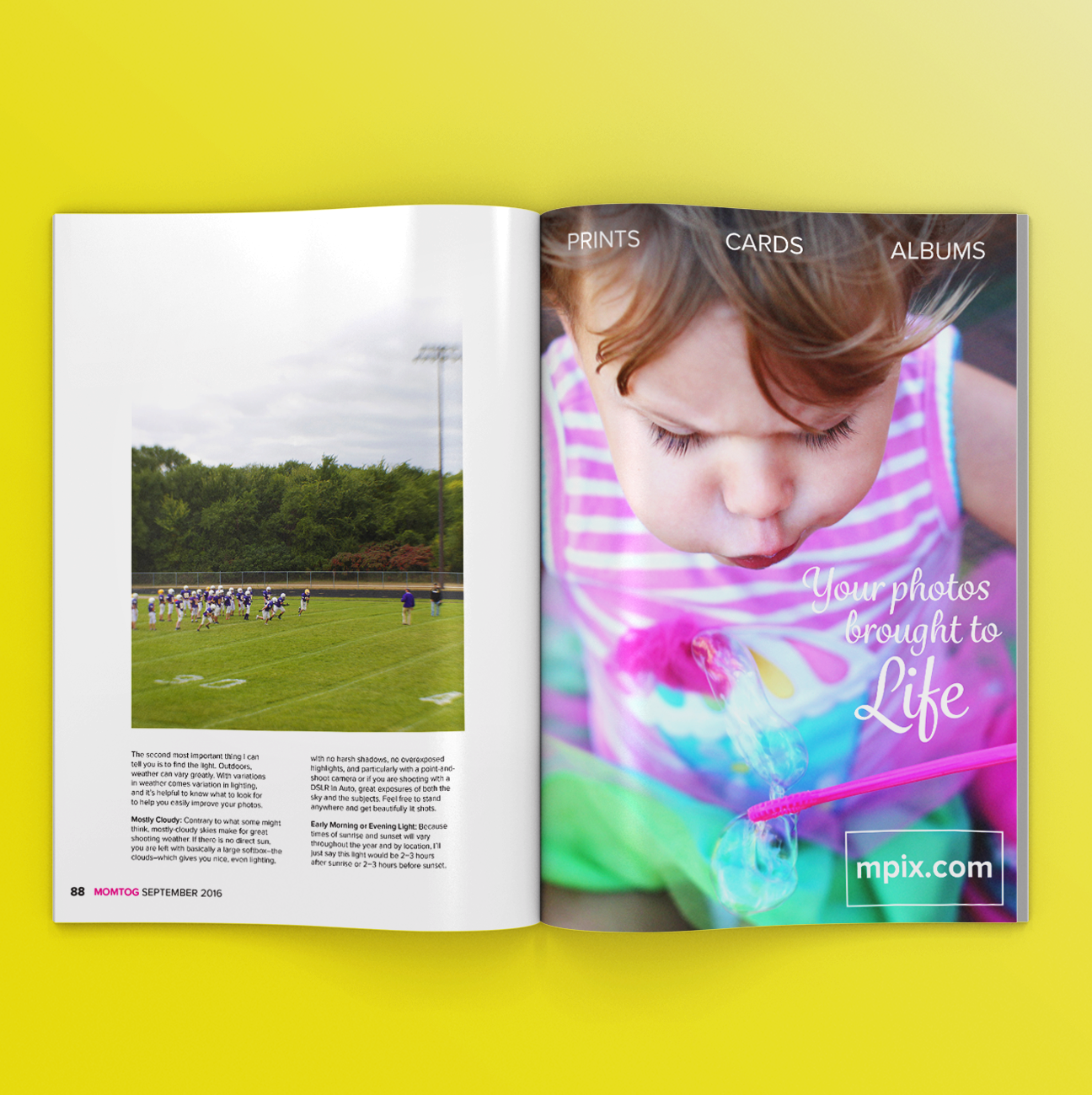
I created several ads for the publication that utilize full page imagery and clean, complimenting text. Advertisements inside this publication feature products and services appealing to the typical MomTog reader and include photo and album printing and storage services, clothing companies specializing in the style of clothing best suited for photographs and often integrated into the style guides.
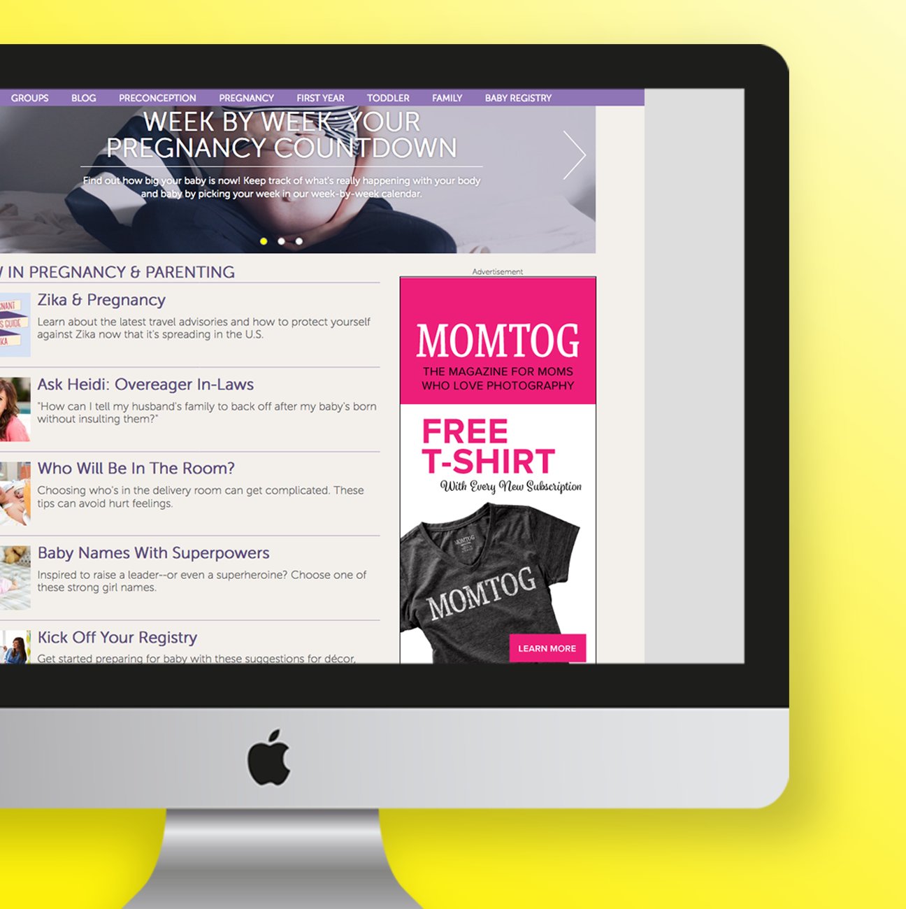
I developed an external advertisement approach as well, including full page ads consistent with the MomTog layout-style: large margins, clean hierarchy with pops of pink paired with full-bleed, colorful imagery. A drop-out subscription card prompts the reader to sign up for a reduced rate and a free T-shirt incentive. Additionally, I visualized web banner ads for MomTog to appear in the sidebar of parenting websites.